Monitoring key performance indicators (KPIs), sales or any other product data means working within an ecosystem where very often you will see metrics correlating with each other. When a normal correlation between two metrics is broken, we have reason to suspect something strange is happening.
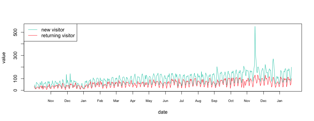
As an example, take a look at anomaly.io analytics during its early days (a long time ago). In the graphic above, the new users are shown in green and the returning users in red. Clearly, something strange happens in the middle of November. Let’s use some techniques to find out more!
Step 1: Collect the Data
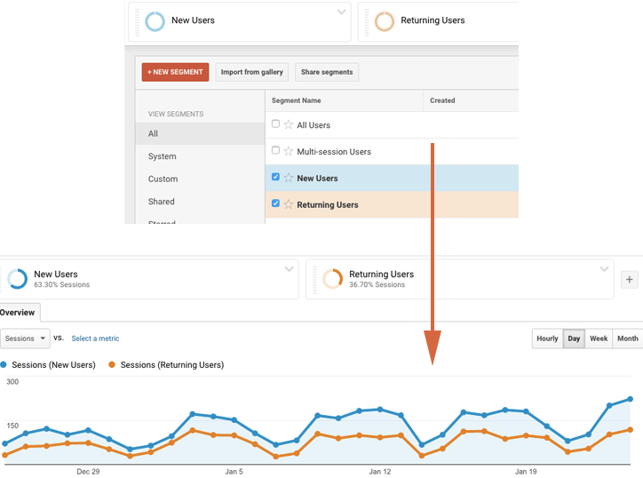
With Google Analytics it’s fairly easy to download data on new and returning visitors. Here at Anomaly.io we detect problems in real time, so we prefer streaming our Google Analytics in real time. But for the sake of simplicity, we will use a plain CSV file for this exercise.
You can download your own Google Analytics data, or use my sample monitoring data file if you wish: new-vs-returning-visitor.csv.
1 2 3 4 5 6 7 8 9 10 11 12 13 14 15 16 17 18 19 20 21 22 23 24 25 26 27 28 29 30 31 | #R language install.packages("dplyr") library(dplyr) #load data csv = read.csv("/path/to/new-vs-returning-visitor.csv") #load new visitor new = filter(csv,Segment=="New Users") new_data = new[4]$Sessions new_date = as.Date(lapply(new[1], as.character)$Day_Index, "%m/%d/%y") new_df = data.frame(date=new_date, value=new_data) #load returning visitor return = filter(csv,Segment=="Returning Users") return_data = return[4]$Sessions return_date = as.Date(lapply(return[1], as.character)$Day_Index, "%m/%d/%y") return_df = data.frame(date=return_date, value=return_data) #plot plot_df = function(new_df, return_df = NULL, ylim=c()) { plot(value ~ date, new_df, xaxt="n", type="l", col="#00c7b0", ylim=ylim, lwd=2) date_axis = new_df$date[1:(length(new_df$date)/30.5)*30.5]+2 axis(1, date_axis, format(date_axis, "%b"), cex.axis = .7) if(!is.null(return_df)) { lines(value ~ date, return_df, xaxt="n", type="l", col="#ff0816", lwd=2) } } plot_df(new_df, return_df) legend("topleft", c("new visitor","returning visitor"), col=c("#00c7b0","#ff0816"), lty=c(1,1)) |
Now you have two variables in your R environment:
- new_df: new visitors
- return_df: returning visitors
Step 2: Verify the Cross-Correlation
Our analysis is based on the time series being correlated, so before going any further, let’s ensure that this is the case. To do so, we need to check using Cross-Correlation. Check this article if you want to Understand the Cross-Correlation algorithm.
1 2 3 4 5 6 7 8 9 | library(stats) library(forecast) ma_new_data = ma(new_data, 3) ma_new_data = ma_new_data[!is.na(ma_new_data)] ma_return_data = ma(return_data, 3) ma_return_data = ma_return_data[!is.na(ma_return_data)] corr = ccf(ma_new_data, ma_return_data, lag.max = 0) corr # display 0.876 |
As the Moving Average is robust to anomaly we use it to remove potential outliers before computing the correlation. The Cross Correlation Function (CCF) is a very high value of 0.876. Clearly, the time series are correlated.
Step 3: Subtract the Time Series
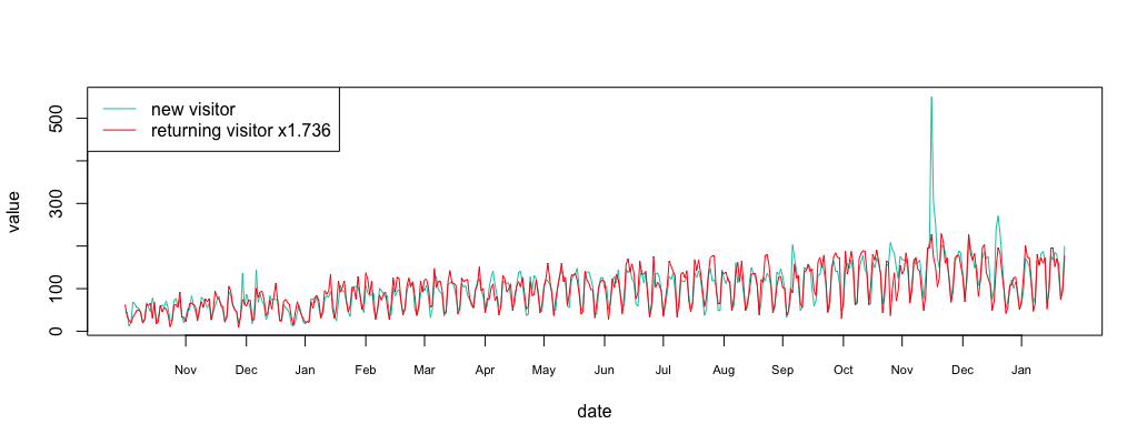
We can compute that there are 1.736 times more new visitors than returning visitors. Let’s align the metrics at the same level.
1 2 3 4 5 6 7 | multi = sum(ma_new_data/ma_return_data)/length(ma_return_data) multi #display 1.736529 align_return_df = return_df align_return_df$value = align_return_df$value*multi plot_df(new_df, align_return_df) legend("topleft", c("new visitor","returning visitor x1.736"), col=c("#00c7b0","#ff0816"), lty=c(1,1)) |
1 2 3 | substract = return_df substract$value = new_df$value - return_df$value*multi plot_df(substract) |
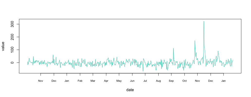
Step 4: Find Outliers in Correlated Time Series
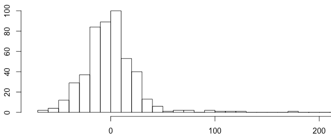
The resulting signal looks like “noise”. Plotting the histogram show a normally distributed signal. We already know how to detect anomalies in a normally distributed time series using the 3-sigma rule.
1 | hist(substract$value, breaks = 50) |
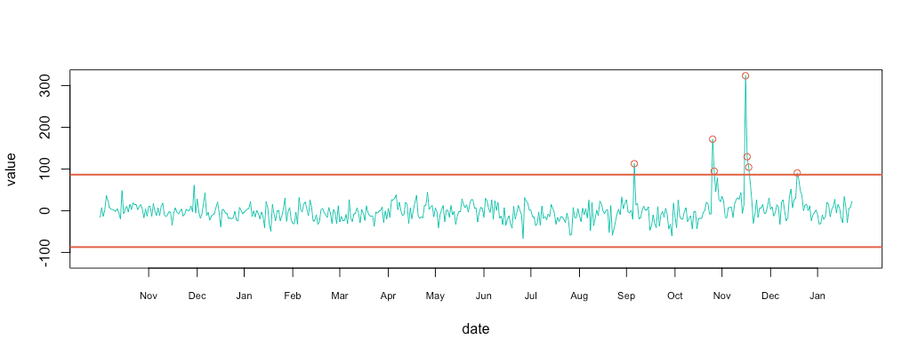
The 3-sigma rules express that nearly all values are taken to lie within three standard deviations of the mean. Everything outside this range can be treated as anomalous.
1 2 3 4 5 6 7 8 9 10 11 12 13 14 15 16 17 18 | #compute 3 sigma minimal & maximal min = mean(substract$value, na.rm = T) - 3*sd(substract$value, na.rm = T) max = mean(substract$value, na.rm = T) + 3*sd(substract$value, na.rm = T) # plot metric & limit plot_df(substract, NULL, c(-120,320)) abline(h=max, col="#e15f3f", lwd=2) abline(h=min, col="#e15f3f", lwd=2) # plot cercle position = data.frame(id=seq(1, length(substract$value)), value=substract$value, date=substract$date) anomalyH = position[position$value > max, ] anomalyH = anomalyH[!is.na(anomalyH$value), ] anomalyL = position[position$value < min, ] anomalyL = anomalyL[!is.na(anomalyL$value), ] anomaly = data.frame(id=c(anomalyH$id, anomalyL$id), value=c(anomalyH$value, anomalyL$value), date=c(anomalyH$date, anomalyL$date)) anomaly = anomaly[!is.na(anomaly$value), ] points(x = anomaly$date, y=anomaly$value, col="#e15f3f") |
Conclusion
Looking at the initial retention graph, I was able to spot 1 or 2 anomalies when in reality I had 7. I actually remember back in mid-November when I received the automatic anomaly report. I started digging into the problem, and found out that someone had shared my twitter anomaly review on Hacker News.
Monitor & detect anomalies with Anomaly.io
SIGN UP sending...