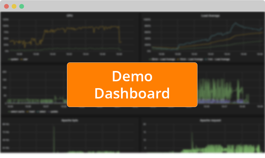
Real Time Charts

Your metrics are displayed in real time right in your web browser. We leverage Grafana, which provides a beautiful and highly configurable dashboard. Display your metrics in many different ways. Create and customize your favorite dashboard using a powerful yet easy query language.

GET STARTED
this is live data!

arrow1

Create some activity…
demo-website2

…then monitor it
demo-dashboard2

grafana1

Grafana integration

Display your metrics in Grafana, the famous open source dashboard project. You can create and compose dashboards to visualize your time series in real time. You can select any point in time you need to visualize your data. It’s very easy: simply edit and watch your metrics right in your web browser.

all-graph1

Customize Dashboards

You can alter the display of your metrics using bars, lines, and points. You can also change colors as well as the overall look and feel. Select Y-axis types such as milliseconds, percentage, Ko, Mo and many more. From the dashboard, create and choose to display metrics you’re interested in. As soon as you make a change, you see the results.

this is live data!

arrow1

code2

Query Language

The dashboard includes a query language that is very easy to use. Click on any metric segment to change it, or quickly add functions (min, max, median, distinct, percentile, derivative, etc.) Just fill in the template to display the metrics you want, the way you want to see them. You can also use the query language for a complex dashboard.

white1

Integration

We provide Grafana as a service for free; it’s open source, which provides you with many advantages. For example, you can access the Grafana source code to edit it to exactly match your needs. Grafana is written in Javascript, an easy language to understand and customize.

Detect anomalies and monitor your metrics now.

Sign up for Anomaly today.

GET STARTED