To determine the level of correlation between various metrics we often use the normalized cross-correlation formula.2
Definition: Normalized Cross-Correlation
Normalized cross-correlation is calculated using the formula:
$$norm\_corr(x,y)=\dfrac{\sum_{n=0}^{n-1} x[n]*y[n]}{\sqrt{\sum_{n=0}^{n-1} x[n]^2 * \sum_{n=0}^{n-1} y[n]^2}}$$
We recommend first understanding normalized cross correlation before using it, but any statistical language, such as R, can easily compute it for you.
Correlations between 2 metrics
In the following graph, the two metrics show some correlation between each other.
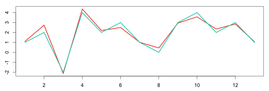
1 2 3 4 5 6 | # plot the graph in R set.seed(15) a = c(1,2,-2,4,2,3,1,0,3,4,2,3,1) b = a + rnorm(length(a), sd = 0.4) plot(ts(b), col="#f44e2e", lwd=3) lines(a, col="#27ccc0", lwd=3) |
Using R to compute the normalized cross-correlation is as easy as calling the function CCF (for Cross Correlation Functions). By default, CCF plots the correlation between two metrics at different time shifts. It’s easy to understand time shifting, which simply moves the compared metrics to different times. This is useful in detecting when a metric precedes or succeeds another.
1 2 3 | # compute using the R language corr = ccf(a,b) corr |
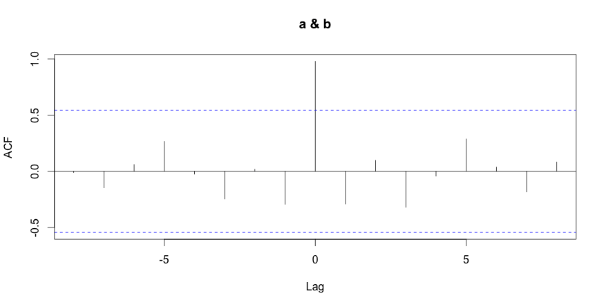
| -8 | -7 | -6 | -5 | -4 | -3 | -2 | -1 | 0 | 1 | 2 | 3 | 4 | 5 | 6 | 7 | 8 |
| -0.011 | -0.146 | 0.061 | 0.266 | -0.025 | -0.246 | 0.018 | -0.293 | 0.979 | -0.291 | 0.098 | -0.320 | -0.043 | 0.288 | 0.037 | -0.183 | 0.083 |
The last R command displays the correlation between the metrics at various time shift values. As expected, the metrics are highly correlated at time shift 0 (no time shift) with a value of 0.979.
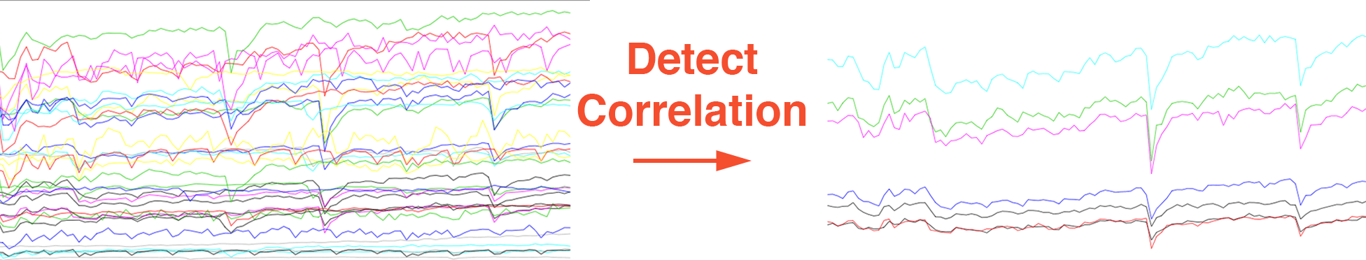
Cluster Correlated Metrics Together
We can also use the CCF function to cluster similar metrics together based how similar they are. To demonstrate this better, we will cluster metrics from a real data set of 45 graphs call “graph45.csv”.
First, we need to compute the correlating level between every possible pair of graphs. This is what the “correlationTable” function does. (To reproduce this example you must download the data set graphs45.csv).
1 2 3 4 5 6 7 8 9 10 11 12 13 14 15 16 17 18 19 20 | correlationTable = function(graphs) { cross = matrix(nrow = length(graphs), ncol = length(graphs)) for(graph1Id in 1:length(graphs)){ graph1 = graphs[[graph1Id]] print(graph1Id) for(graph2Id in 1:length(graphs)) { graph2 = graphs[[graph2Id]] if(graph1Id == graph2Id){ break; } else { correlation = ccf(graph1, graph2, lag.max = 0) cross[graph1Id, graph2Id] = correlation$acf[1] } } } cross } graphs = read.csv("graphs45.csv") corr = correlationTable(graphs) |
It took around 20 seconds to compute all the correlation possibilities between every pair of graphs. The array corr now contains the correlation table; for example, corr[4,3] gives a correlation level of 0.990 between graph4 and graph3. Such a high correlation level indicates a strong correlation between the graphs. To find metrics with sufficiently high correlation, we choose a minimum correlation level of 0.90.
Let’s find and plot all the metrics that strongly correlate with graph4:
1 2 3 4 5 6 7 8 9 | findCorrelated = function(orig, highCorr){ match = highCorr[highCorr[,1] == orig | highCorr[,2] == orig,] match = as.vector(match) match[match != orig] } highCorr = which(corr > 0.90 , arr.ind = TRUE) match = findCorrelated(4, highCorr) match # print 6 12 23 42 44 45 3 |
Success! Graph4 highly correlates with graphs 6, 12, 23, 42, 44, 45 and 3.
Let’s now plot all the graphs together:
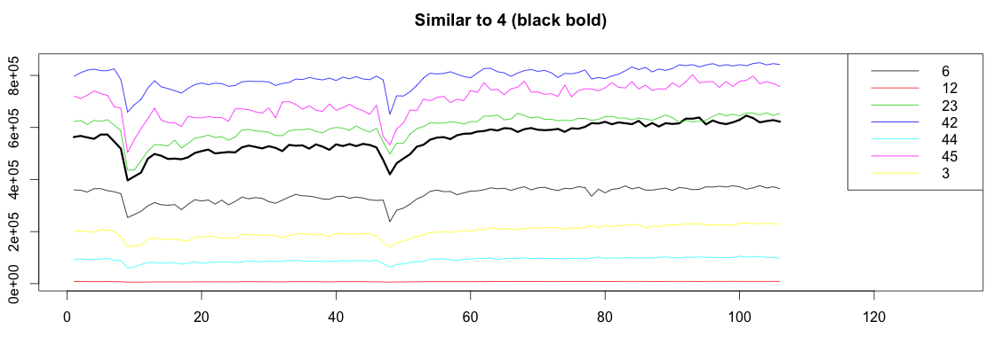
1 2 3 4 5 6 7 8 9 10 11 12 13 14 15 16 17 18 19 20 21 22 23 24 25 26 27 28 29 30 31 | bound = function(graphs, orign, match) { graphOrign = graphs[[orign]] graphMatch = graphs[match] allValue = c(graphOrign) for(m in graphMatch){ allValue = c(allValue, m) } c(min(allValue), max(allValue)) } plotSimilar = function(graphs, orign, match){ lim = bound(graphs, orign, match) graphOrign = graphs[[orign]] plot(ts(graphOrign), ylim=lim, xlim=c(1,length(graphOrign)+25), lwd=3) title(paste("Similar to", orign, "(black bold)")) cols = c() names = c() for(i in 1:length(match)) { m = match[[i]] matchGraph = graphs[[m]] lines(x = 1:length(matchGraph), y=matchGraph, col=i) cols = c(cols, i) names = c(names, paste0(m)) } legend("topright", names, col = cols, lty=c(1,1)) } plotSimilar(graphs, 4, match) |
Conclusion
Here at anomaly.io, finding cross-correlation is one of the first steps in detecting unusual patterns in your data. Subtracting two correlated metrics should result in an almost flat signal. If suddenly the flat signal (or the gap between the curves) hits a certain level, you can trigger an anomaly. Of course this is an oversimplification and the reality is much more complex, but it’s a good foundation to work from.
Monitor & detect anomalies with Anomaly.io
SIGN UP sending...